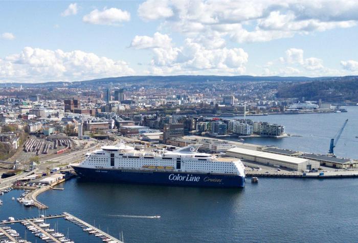
OSLO: Orange is the New Black

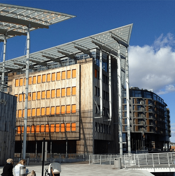
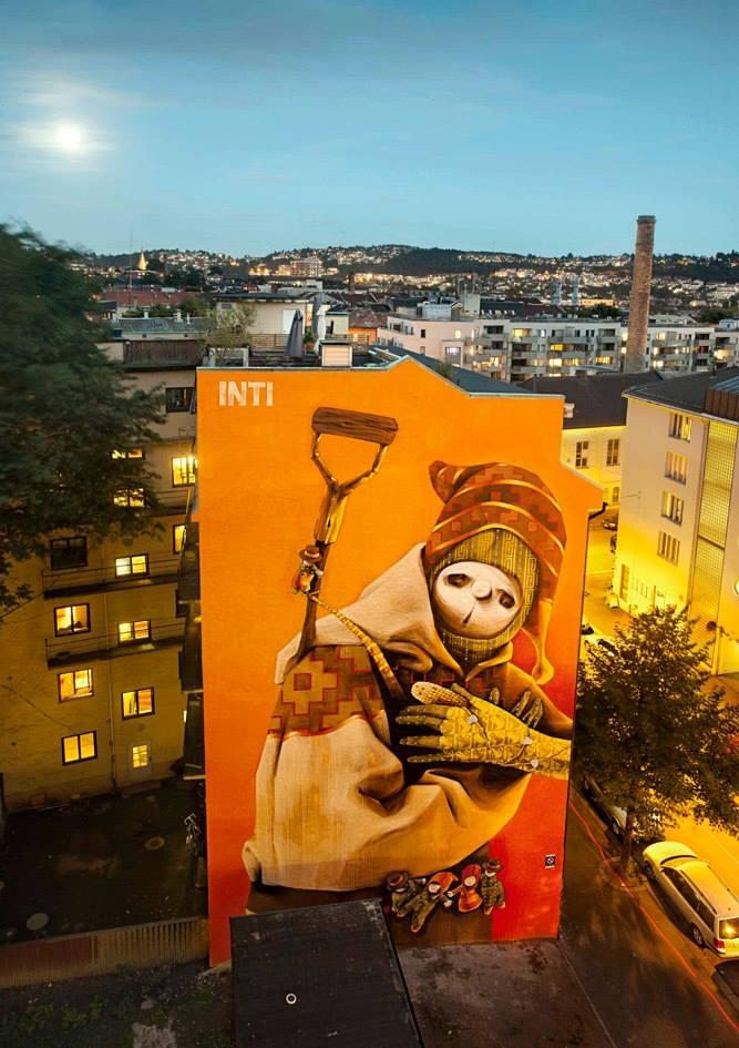
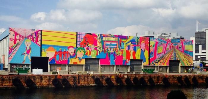
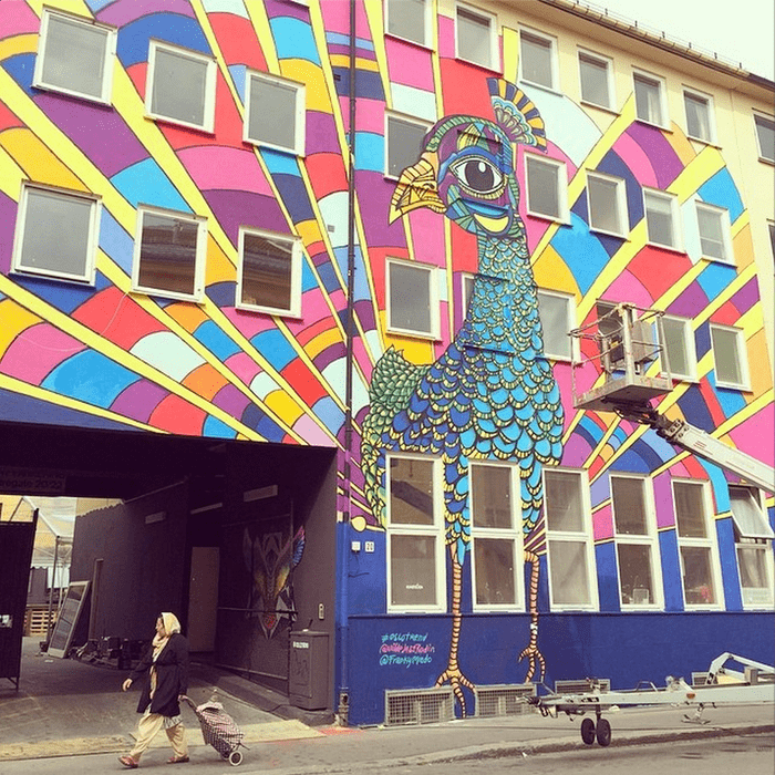
Oslo is starting to get it’s colors on, and this year, a happy, fresh orange is popping up all over the place. The Astrup Fearnley Museum with it’s bright orange sun screening has gotten plenty of company.

Written by Dagny Thurmann-Moe
17. august 2014

The Astrup Fearnley museum was first out a few years ago, with these striking orange shutters. It’s a color that works well with the Norwegian light, it not only looks stunning towards the blue skies, it’s also the perfect boost of energy during our dark winter months (let’s hope they keep them down ;))

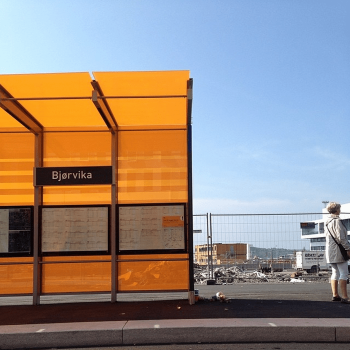
Another area that’s also in current development, Bjørvika, has chosen the exact same nuance of orange. I’m very curious to see how this area develops, and if it can avoid feeling cold, elegant and hard. It desperately needs warmth and atmosphere, and this bus stop is definitely a step in the right direction. None of the buildings planned have any color, and it will require a small forrest of greenery to give it an inviting and cozy feel to it (and to be quite honest, some of the buildings need a dash (or a lot) of color too.)

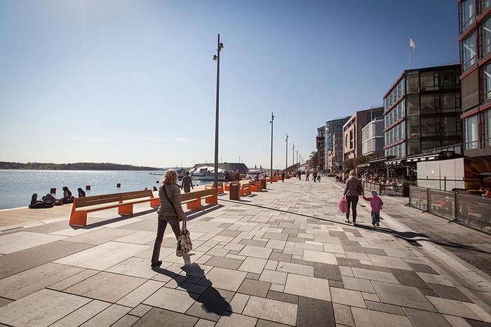
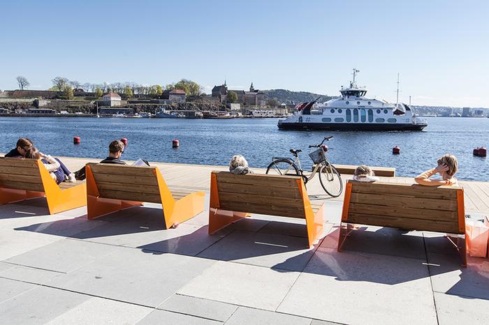
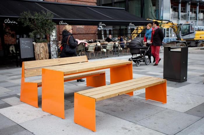
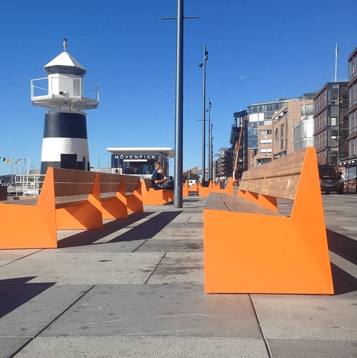
I first heard of Vestre’s bench project via an instagram reader when they were getting installed (yes, I know, late to the party ;)). Anyways, Vestre’s outdoor furniture is pretty awesome, and in my opinion, perfect to oomph up the boring architecture in Aker Brygge.

Aker Brygge is a popular summer destination in Oslo, both among tourists and locals. I’ve always found it’s modern architecture pretty characterless and these bright pops of orange, were exactly what the place needed.

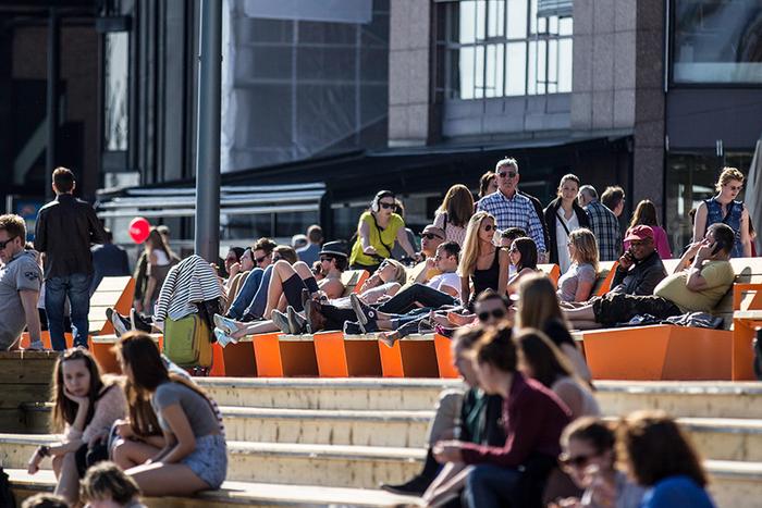
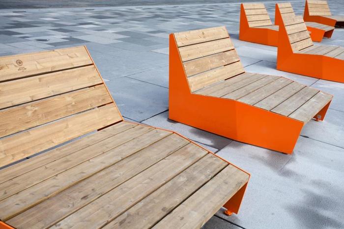
There’s (what feels like hundereds) of bright orange benches (color code: RAL 2003) scattered around the promenade, and they’re practically begging for you to sit down and test them out. Especially the daybeds!

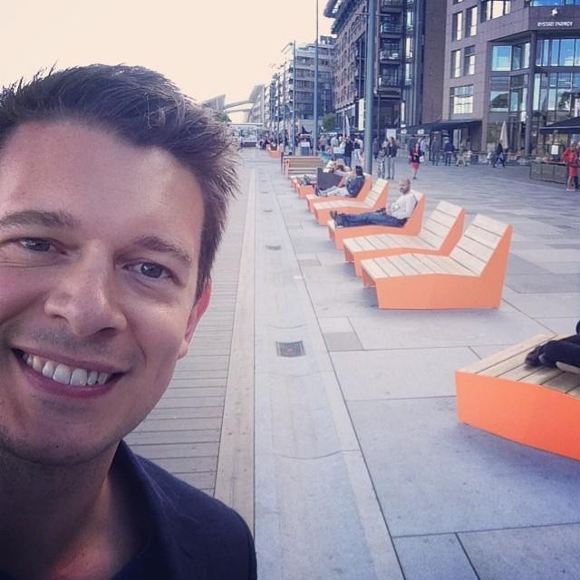
So, feeling a little bit over-enthusiastic about the project, I had to chat with one of the two designers (the other one being Atle Tveit) behind the BLOC furniture by Vestre – hello Lars Tornøe!! :D (you can tell he’s a little bit excited about the project, can’t you, hehe. This photo is from his instagram account) I decided that I had to ask him a few questions about the design and the colors (of course):

Who: My name is Lars Tornøe and I have been a designer since 2006.

What: Primarily I design furniture and domestic objects for various clients. Most of them are Scandinavian. My process depends on the object and the material I am working with but most of my ideas come from a detail in form or geometry, so I am really into working with models and 3D. Every now and then I do projects together with designer friends for fun.

Where: My studio is in Stavanger. I moved here mainly because of my girlfriend and our son.

What is the idea behind the Bloc collection?

There is a sharp, diagonal bend that creates subtle facets on all the products. The bend adds rigidity to the parts and a visual theme to the collection. Another feature of the collection is the quite massive look of the objects.

Is color an important factor?

It certainly is, given the size of the steel parts. That gives color a big impact. But it is really up to the customer to choose what color they want.

Orange is kind of a surprising, but very welcome choice for the Bloc benches in Aker Brygge. Do you know why that particular color was chosen?

The landscape design of the Aker Brygge waterfront was done by Link Landskap. I think the orange colour was derived from the signal orange colours you can find in maritime settings. It was a bold choice of color that worked really well.

What is your relationship with colors and design? Are colors important?

Colors are very important. I think they add to the personality of a product just like the form does. Usually I have an idea about the personality I am trying to create and the choice of colors follows naturally. Sometimes my work has to be very commercial and then you have to consider the customers taste as well. On top of that the brands might have their own color scheme.

What do you have going on the next few months that we should know about?

I am developing several new products with different brands right now and will be focusing on that until winter. I hope to get most of it ready for the Stockholm Furniture Fair in February!

Want to follow the Norwegian designer, and see what he’s up to? Follow Lars on Instagram or visit his Website.
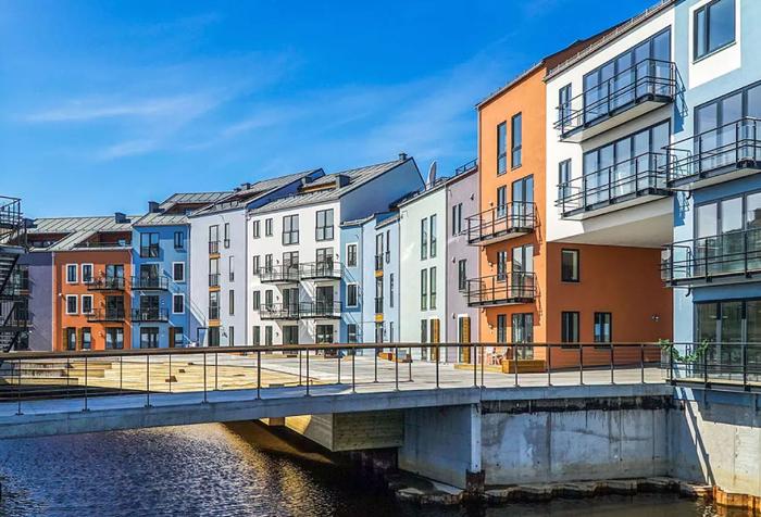
All in all, I’m happy to see colors finally making it’s way back to the city, and would love to see more! And I have to say, these three projects below, are definitely a step in the right direction. (and all THREE have the same pops of orange as well! :D )

Meld deg på våre nyhetsbrev

Koi Fargestudio tilbyr fargerådgivning og utvikling av fargekonsepter. Hold deg oppdatert om alt som skjer i studioet ved å registrere deg.

Markedsføringstillatelser
KOI vil bruke informasjonen du gir på dette skjemaet for å komme i kontakt med deg og for å gi oppdateringer og markedsføring.

Vi bruker Mailchimp som vår markedsføringsplattform. Ved å klikke nedenfor for å abonnere, godtar du at informasjonen din vil bli overført til Mailchimp for behandling. LÆR MER OM MAILCHIMP'S PERSONVERNPRAKSIS HER.

Ta kontakt

Koi Fargestudio tilbyr fargerådgivning og utvikling 
av fargekonsepter. Bruk gjerne kontaktskjemaet eller send en 
e-post. Vi hører gjerne fra deg!

Adresse
Rådhusgata 11
0151 Oslo

Kontaktinfo
+4792014333
mail@koifargestudio.no

Meld deg på Kois fargenytt!

Nyhetsbrevet kommer i ujevn rykk og napp, mer etter innfallsmetoden og hvis vi har noe på hjertet, enn i en veldig fast form. Så vil du være med på litt ukentlig, månedlig eller kvartalsvise fargeinspo og samtale, synes vi det er stort stas!